8. Demographic history and conservation genetics
After this chapter, the students can describe how demographic histories are inferred using MSMC2 and MSMC-IM. They can draw conclusions from the results and describe the impact of historical population structure on the estimates of \(N_e\). Secondly, the students can describe the impact of population structure on the amount of genetic variation and the effects of this in conservation genetics. They can interpret the results of conservation genetic studies and related theoretical simulations.
Demographic analyses
A central aim of many population genetic studies is to understand the changes in population size over time. The genomes do not contain information about \(N_c\), the census size of populations, but they do contain rich footprints that allow estimating \(N_e\), the effective size of populations. The two measures may or may not correlate, but it is clear that a small \(N_c\) leads to a small \(N_e\). For the genetic properties of a population, only the latter matters.
Quick rehearsal of coalescence process
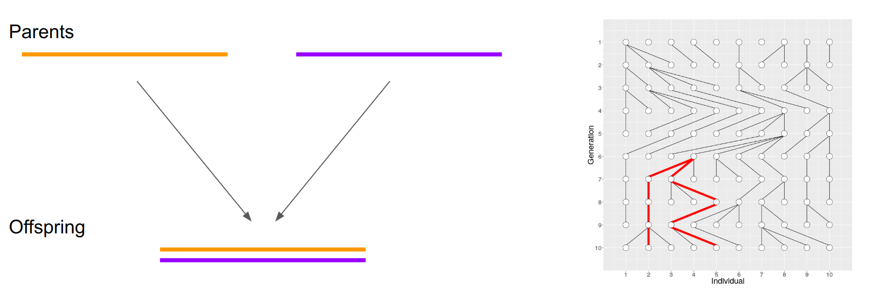
As learned previously, a diploid offspring obtains a sequence for a locus from two parents. These parents have have similarly obtained from their ancestors and the copies derive from a common ancestor. The expected time to Most Recent Common Ancestor (MRCA) depends on \(N\) (that, in theoretical context, naturally means \(N_e\)).
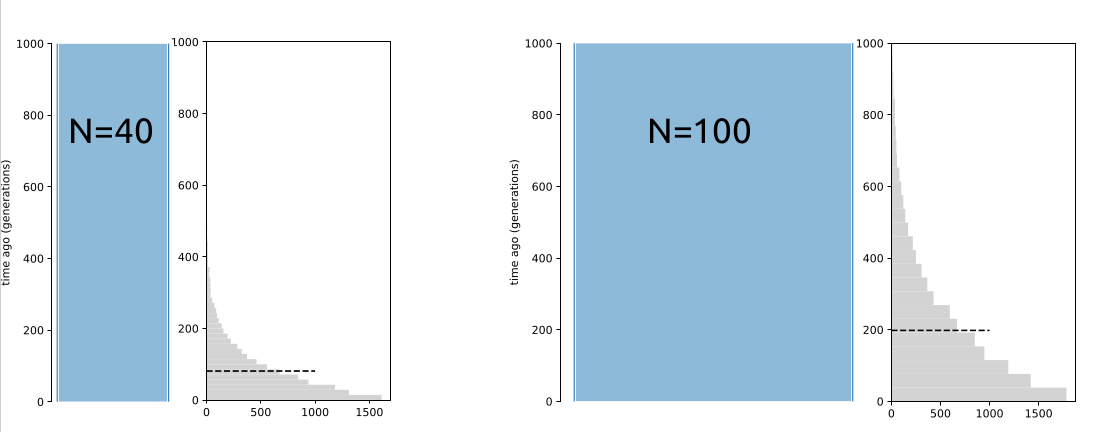
Having the estimates of mutation rate per generation and generation time, the divergence time of two sequences can be estimated from the number of differences between them. For two sequences, the expected time to MRCA, \(T_{MRCA}\), follows a geometric distribution with the mean of \(2N\) generations. Knowing the mean of \(T_{MRCA}\) (y-axis), \(N\) (width of blue boxes) can be easily resolved:
However, for a small number of samples, the variance of \(T_{MRCA}\) is huge and a single estimate is unreliable.
The genome provides a solution and a challenge for that: chromosomes consists of fragments – brought together by past recombination events – that have different evolutionary histories. If one can separate the fragments with distinct histories, one can estimate the histories of numerous independent sequence pairs and thus reduce the variance.
PSMC and MSMC2
The above challenge, inferring the fragments of the genome with different evolutionary histories, was tackled with programs PSMC, MSMC and MSMC2.
Heng Li and Richard Durbin (2011) described “Pairwise sequentially Markovian coalescent” (PSMC) to infer demographic history from one diploid sequence. Schiffels & Durbin (2013) extended this to “Multiple sequentially Markovian coalescent” (MSMC) with improved accuracy. Schiffels and others further developed this into a new version, MSMC2. Underlying concepts are easier to understand through PSMC.
PSMC
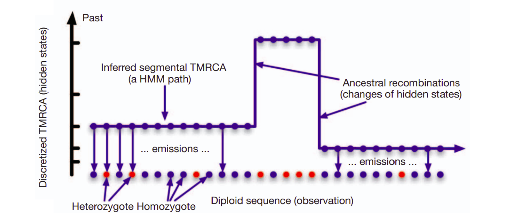
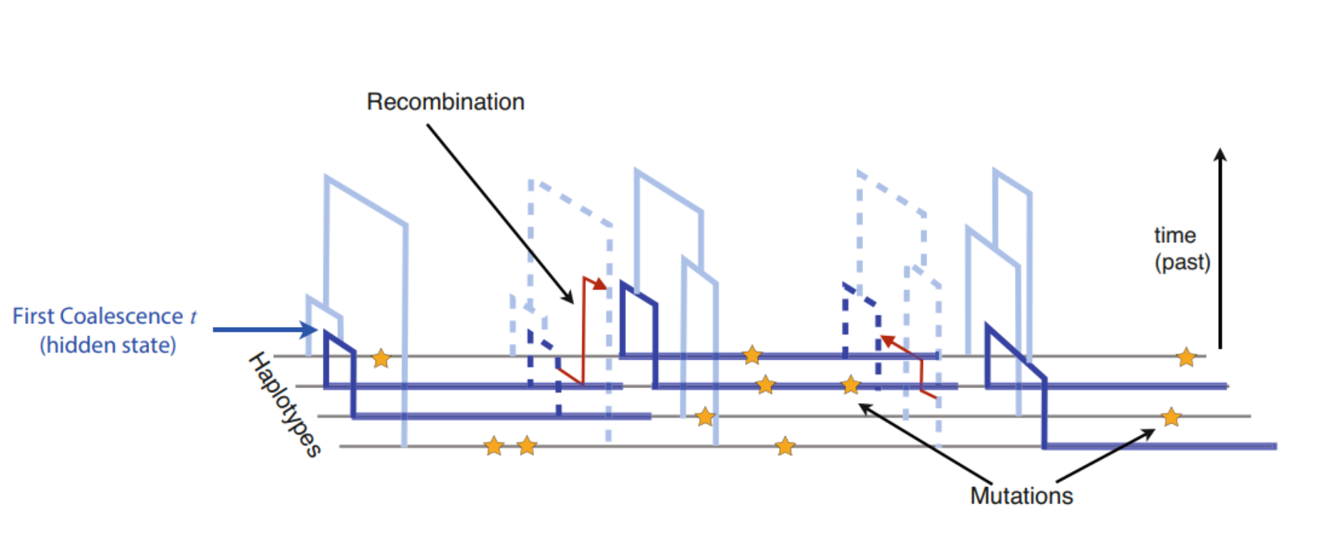
The input data for PSMC is one diploid genome, the two chromosomes shown below in orange and magenta. The observation are the differences between the two sequences, shown as blue dots. The unknown information are the ages of genome fragments (y-axis) as well as the recombination points (red arrows) where the shared history of a fragment ends.
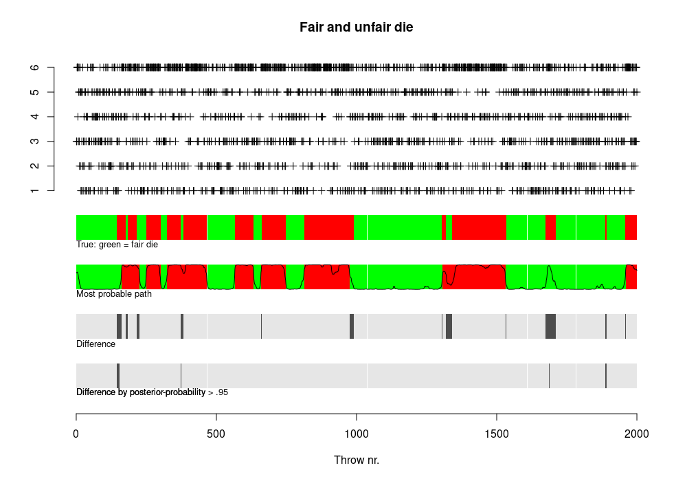
In PSMC, the ages of genome fragments (\(T_{MRCA}\)) is the hidden state: whereas in the casino example we only had two hidden states (fair, loaded), there are many “age” states. This is how PSMC described it.
As shown in the very beginning, the distribution of \(T_{MRCA}\) under a constant population size follows geometric distribution and the mean of \(T_{MRCA}\) allows estimating \(N\). In reality, the population sizes are not constant and \(T_{MRCA}\) does not follow geometric distribution; however, the distribution of \(T_{MRCA}\) allows estimating the changes in population size across time.
PSMC assumes that the history consists of segments of time and, within each segment, the population size is constant. The start and end points of these segments and the population size during that period are then estimated from the data.
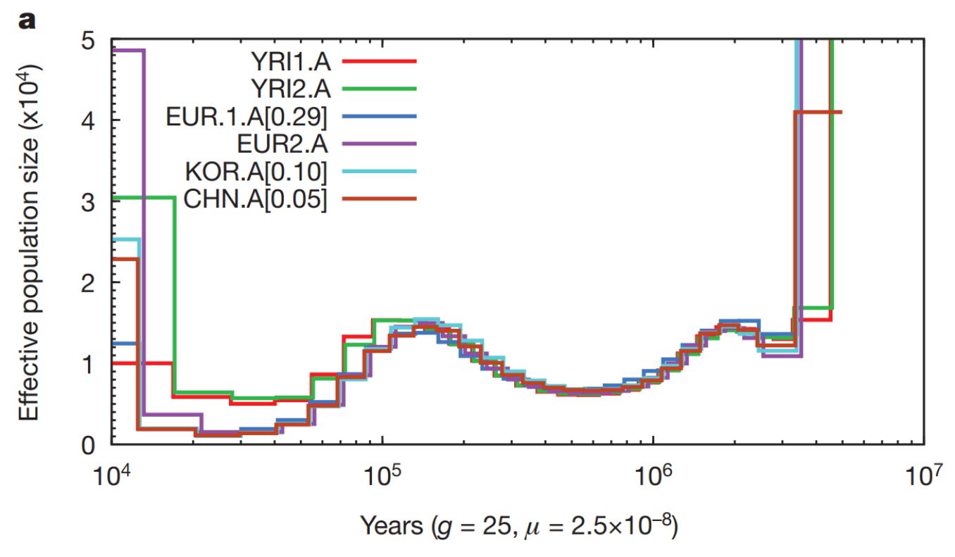
At the time PSMC was created, very few full human genomes were available. However, even with the limited data, the authors showed that Africans (YRI) have not experienced the population bottleneck visible in European (EUR) and Asian (KOR, CHN) individuals:
This was taken as the signal of the Out-of-Africa event.
MSMC and MSMC2
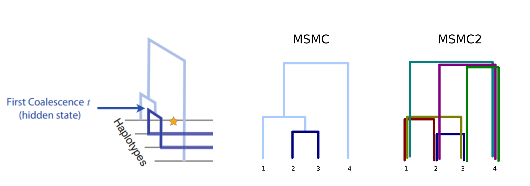
The number of genomes quickly increased and PSMC’s limitation to only utilise one diploid genome at a time became a serious restriction. MSMC was reimplementation of the idea and, with a simultaneous analysis of multiple genomes, produced more accurate estimates. For each genome fragment, MSMC inferred the age of the first coalescence event, shown in dark blue in the figure:
While this gave better estimates of the recent past than PSMC, the use of the first coalescence events only reduced the accuracy in the more distant history. This was changed in the second version of the concept, MSMC2, and instead of just using the information from the first coalescent as in MSMC, now the program utilises the information from all pairwise comparisons:
This also made the computation simpler and faster.
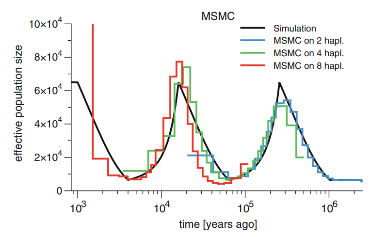
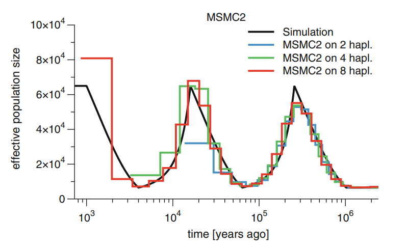
The development in the methods have improved the results. The problem of PSMC was that two sequences have very few “young” events and the accuracy for the very recent past was poor. MSMC improved that with many individuals and could also see the recent changes in population size; the downside of that was that by only considering the first coalescence event, it lost the information about deep events (see figure below, left). MSMC2 may have lost some accuracy in the very youngest events but it doesn’t suffer from the loss of information in the deep events as the number of individual grows (below, right):
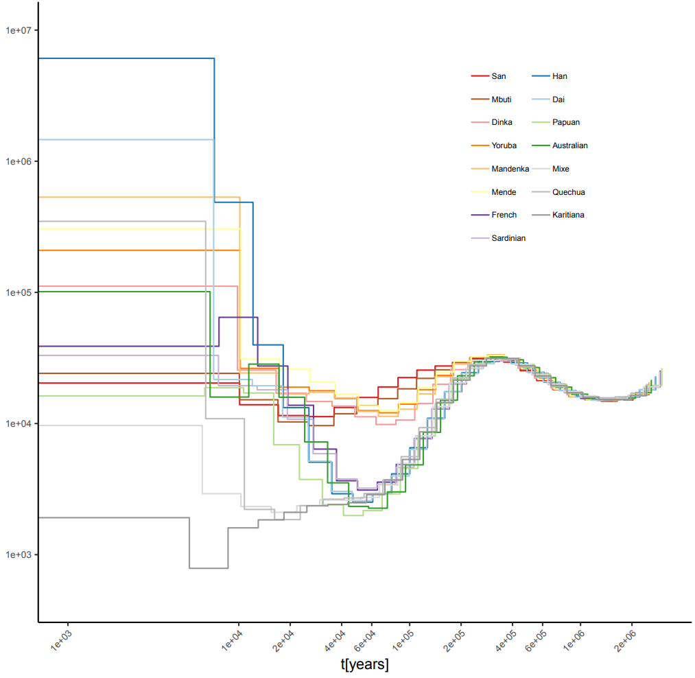
The MSMC2 estimates of human population sizes with four individuals per population show much improved accuracy; the bottleneck in the non-African populations remains:
PSMC is badly outdated and should not be used. If one has only one diploid individual, it can be analysed with MSMC2. Practical instructions for using the method is available here.
Relative cross-population coalescence rate
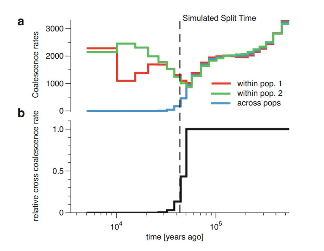
An advantage of MSMC/MSMC2 is that they can analyse individuals coming from two different populations. Then, the demographic model is parameterised by three coalescent rates through time: a coalescence rate between lineages sampled within the first population, a coalescence rate between lineages sampled within the second population, and a coalescence rate between lineages sampled across the two populations. From these, on can compute the relative cross-population coalescence rate (rCCR):
The figure above shows a simulated history of two populations with a clean split 1,500 generations ( 43,500 years with generation time of 29 years). The top part shows the coalescence rates within the populations and across them, and the lower part shows the ratio between the third rate and the sum of the first two. Naturally, all coalescent events do not happen immediately when the two populations are merged into one. A common practice is to use the \(rCCR=0.50\), i.e. the time point where more than 50% of the coalescence events happen across the populations, as the estimate of the population split time.
MSMC-IM
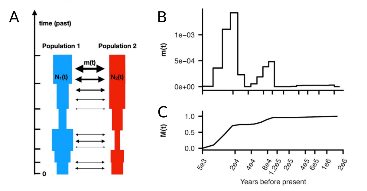
The rCCR-analysis with MSMC2 produces estimates of coalescent rate within populations and between the populations. The rates within populations provide estimates of the effective population sizes across time (figure below, A). The rate across the populations allows estimating the gene flow (migration) between the populations. The estimates of the migration rate are segmented across time and may change (figure below, B). By summing the migration rate across one can estimate the cumulative migration probability which reaches 1 when the populations are fully merged (figure below, B):
These ideas are implemented in the program MSMC-IM. It uses MSMC2 to estimate coalescence rates within and across pairs of populations, and then fits a continuous Isolation-Migration (IM) model to these rates to obtain a time-dependent estimate of gene flow. By considering the migration between the populations, it can adjust the \(N_e\) estimates and reduce the inflation due to gene flow.
Coalescence in a substructured population
Assuming the Wright-Fisher population of a constant size, the expected \(T_{MRCA}\) for many diploid samples approaches \(4N\) generations (or 2 “units”). However, this only applies to W-F populations with a constant size (below, left and middle). In a structured population (right), \(T_{MRCA}\) can be much deeper than expected from \(N\):
In the coalescence framework, a structured population can behave like a population with a much larger effective size. The figures below show the distribution of \(T_{MRCA}\) for 10,000 replicates. The mean of estimates are nearly identical in the two plots in the middle and on the right even though \(N=100\) in the first and \(N=40\) in the second:
Although the population’s census size (\(N_c\)) and effective size (\(N_e\)) often correlate, PSMC/MSMC/MSMC2 estimates are for \(N_e\) and do not always reflect changes in \(N_c\). Many of the “bumbs” in the estimated \(N_e\) trajectories are probably caused by historical population structure.
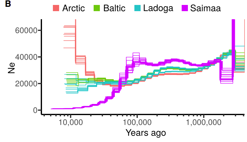
We estimated the demography history of ringed seals and a bump in the demography estimates around 100 kya. This could reflect a larger census size at that time but a historical population structure is a more probable explanation:
Conservation genetics
The increase in \(N_e\) due to population structure is not only a theoretical curiosity but can have real-life consequences e.g. in conservation genetics. This was demonstrated in a recent study of Saimaa ringed seals, an endangered landlocked population of seals living in Lake Saimaa in Eastern Finland.
Population structure
The Saimaa ringed seals are recovering from a drastic population bottleneck and, having only 100-160 individuals in the early 1980s, they are now estimated to total 500 individuals. Having the number of individuals well below 200 during the worst period of the population decline sounds bad, but the small population was additionally divided into separate subpopulations, increasing the local inbreeding and genetic drift. The strong subpopulation structure was created by the labyrinthine topography of the lake, further fragmented by narrow straits and ca. 14,000 islands.
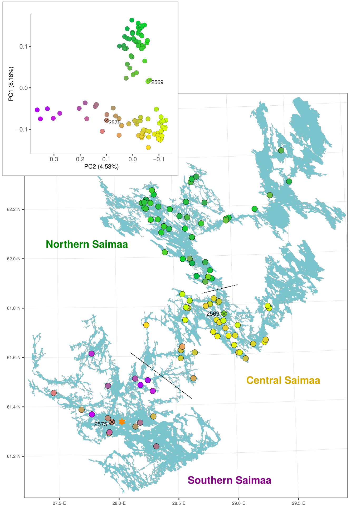
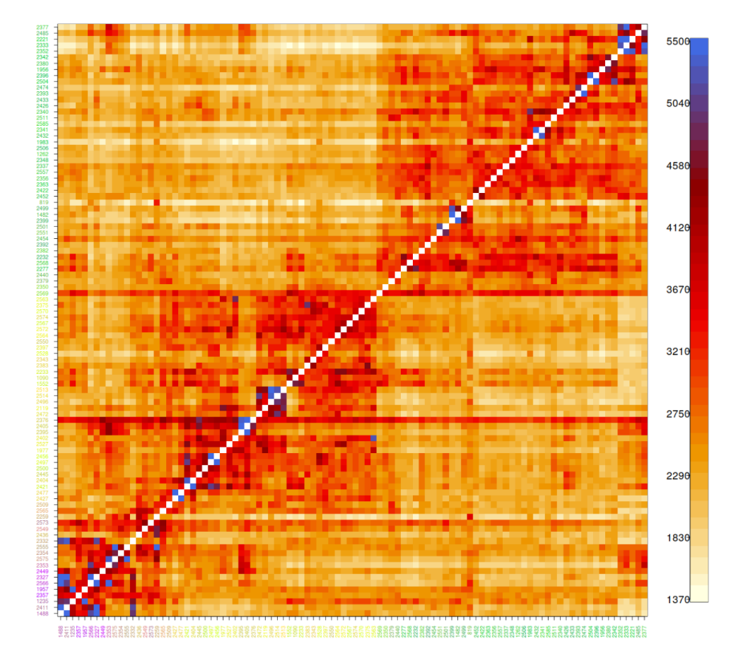
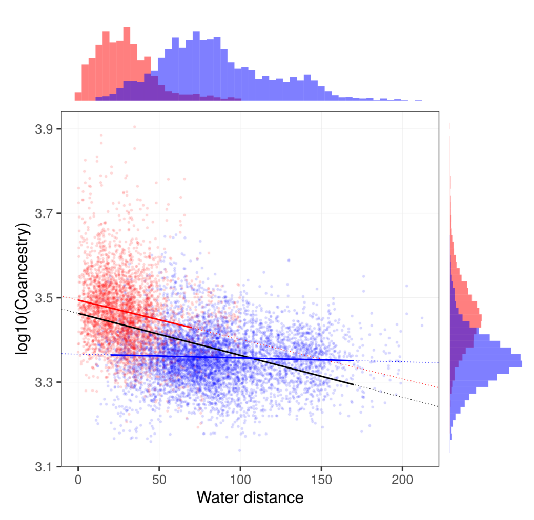
The genetic differentiation among the Saimaa individuals is so low that the simple estimates of genetic differentiation such as IBS distance have poor resolution. We used “coancestry” estimated with FineStructure as the measure of similarity (left). The amount of coancestry showed some correlation with the water distance when considering pairs within lake regions (right, red line) or full data (right, black line) but not when considering only pairs from different lake regions (right, blue line):
This emphasises the strong differentiation of the regions.
Consequences of population structure
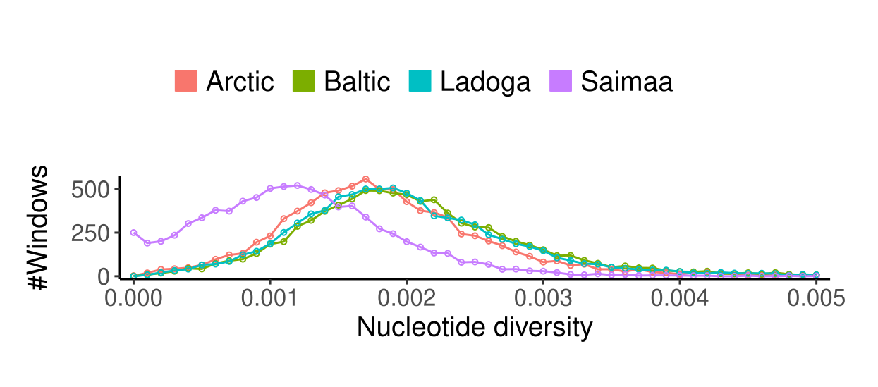
Ringed seals are divided into five subspecies of which we studied the four Atlantic ones. The estimates of genetic diversity were affected by the low sequencing coverage (especially of the Arctic samples) but still showed a clear difference between Saimaa and non-Saimaa populations:
| Arctic | Baltic | Ladoga | Saimaa | |
|---|---|---|---|---|
| \(\pi\) | 0.00189 | 0.00210 | 0.00204 | 0.00125 |
| \(H\) | 0.00190 | 0.00211 | 0.00203 | 0.00118 |
When the genome was divided into blocks of 250 kbp and the genetic was estimated on those, the distribution of \(\pi\) for Saimaa looked similar to those of other subspecies, just shifted closer to 0:
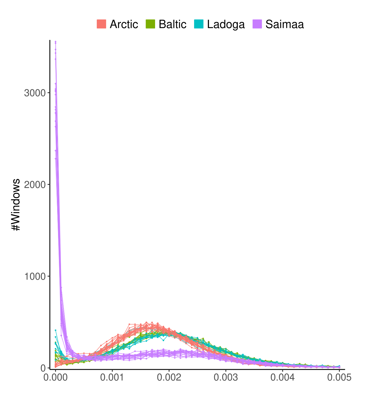
However, when this done for \(H\), the heterozygosity of individuals, the picture looks very different:
All Saimaa individuals have thousands of 250-kbp regions in their genome with basically no variation between the maternal and paternal copies of the chromosome. The difference between \(H\) and \(\pi\) in Saimaa is explained by strong inbreeding, partly caused by the population structure but made worse by a local structure and inbreeding within the three lake regions.
There are attempts to reduce the impacts of inbreeding: two seals were translocated in 2023 and one more in 2024 from the Central Saimaa to Kolovesi (N=2) and to the Southern Saimaa (N=1). A similar translocation of a seal was performed n 1992 as a female, known as Venla, was translocated from the Northern Saimaa to the Southern Saimaa. To everyone’s surprise, this seal was found to be alive 28 years later (and was confirmed to be alive still in 2023).
The impacts of the first translocation seem to be visible in our genetic data. The video (started from button in the top-left corner) visualises the connections between genetically the most similar Saimaa ringed seal pairs. The histogram shows the distribution of coancestry scores (a measure of genetic similarity) and, in the animation, the blue vertical line indicates the current score limit. The seal pairs with a genetic similarity higher than the limit are connected with a line in the PCA plot and the map and highlighted in blue in the matrix.
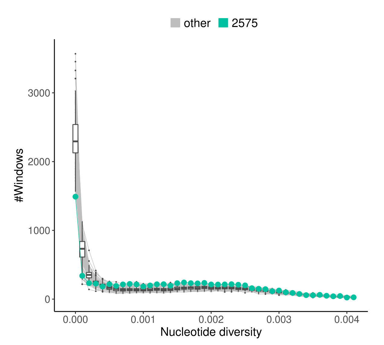
In the final frame, the red lines indicate the highest scoring connection from a seal from the southern part to a seal in the northern part of the lake. The inset map shows that the southern individual 2575 was sampled from the immediate proximity of the living area, indicated with a diamond, of Venla that was translocated from the north in 1992.
Although the differences are not striking, the seal “2575”, the one originating closest to the known living area of Venla, has the most “healthy looking” profile of genetic diversity patterns:
It has fewer genomic blocks with no genetic variation (\(H=0\)) and more regions with \(H>0.0005\) than other individuals in the data.
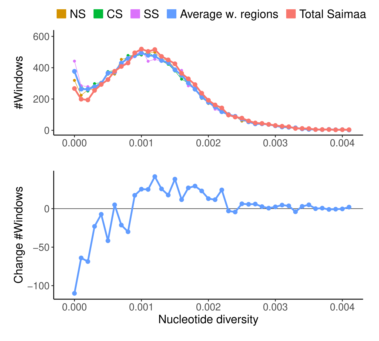
The impact of population structure on the amounts of genetic diversity retained is visible in the estimates of \(\pi\) within the lake regions and in the whole lake:
The lower figure shows the difference between the red (whole lake) and blue (average of within regions) lines in the upper figure. There are fewer genomic regions with no variation and more genomic regions with “high” amounts of variation (\(\pi>0.001\)).
The shape of Saimaa is close to perfect?
Despite the poor state of the Saimaa ringed seal population, the situation could possible be even worse. It seems that the strong population structure has helped the population as a whole to retain some variation across much of the genome. If this variation will spread across the lake due to increased natural migration (and artificial translocations), the population may do fine.
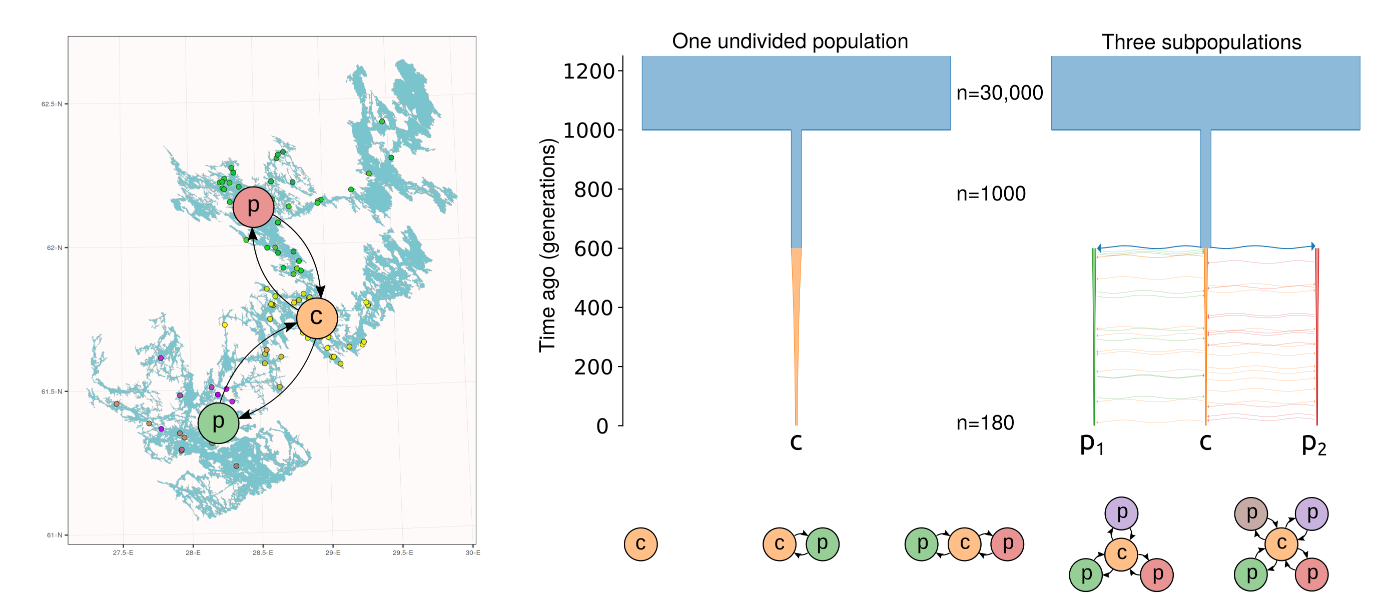
To better understand the role of the population structure in retaining the variation, we performed simulations. Synthetic data was simulated for individuals divided into 1–5 subpopulations and connected with different amounts of migration. The case of one undivided population was considered the baseline. Two subpopulations behave identically but, with the number of subpopulation three or higher, the central population may become a “hub” of higher genetic diversity, connecting the peripheral subpopulations (see figure below, bottom).
In all simulation settings, the population was founded by an initial population of 1,000 individuals 1,000 generations ago, and this was then reduced to 180 individuals during the last 600 generations. In the figure below (top right), models with 1 and 3 subpopulations are shown.
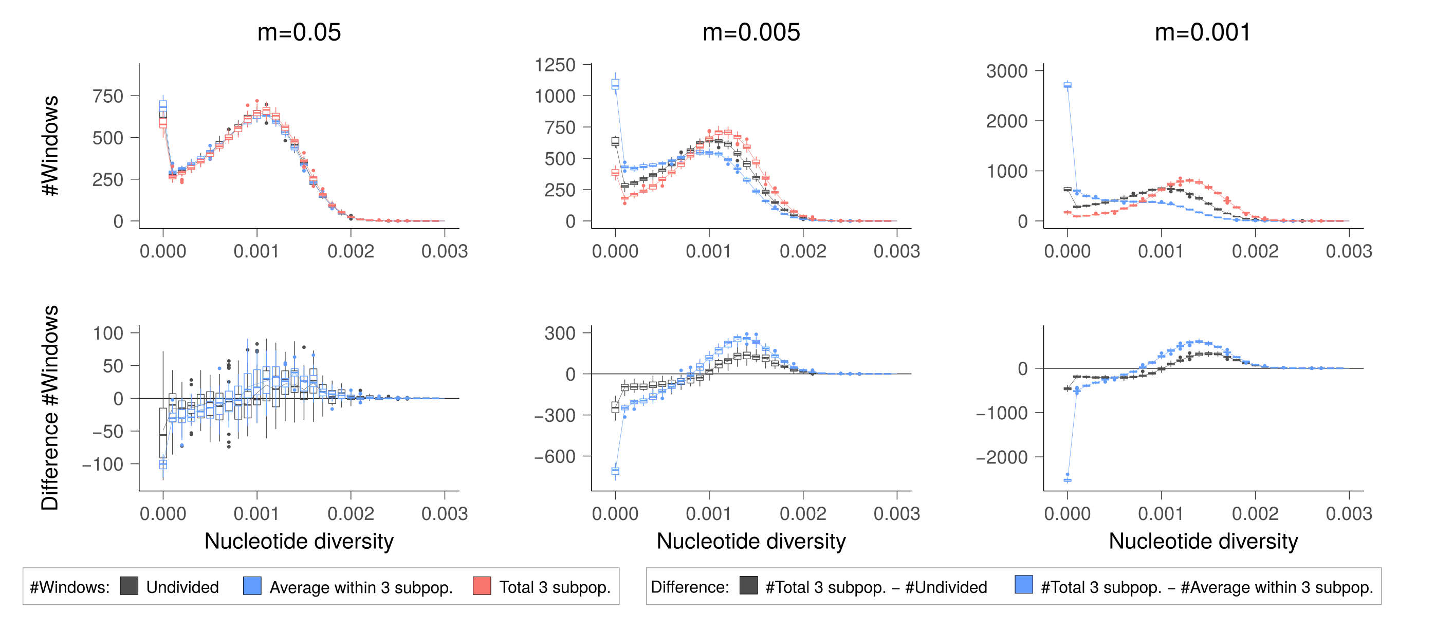
Similarly to the analyses of empirical data, we studied the distributions of nucleotide diversity within 250-kbp genomic blocks. We found that when the migration rate is high (\(m=0.05\)), the subpopulations do not differentiate and the amount of genetic diversity is the same within subpopulations as across them and in one undivided population (figure below, left).
However, when migration rate is moderately low (\(m=0.005\)), the division into subpopulations increase inbreeding and the subpopulations contain more genomic regions with no variation than one undivided population does; however, all the subpopulations together retain more variation than one undivided population does (figure below, middle). The relative behaviour is similar with the lowest migration rate (\(m=0.001\)) but subpopulations become so inbred that it may risk their viability (figure below, right).
The empirical data from Saimaa behaves similarly to the case with a moderately low migration rate (\(m=0.005\)). Although we have criterion to rule when the inbreeding reaches a critical level, the split to three subpopulations seems to be close the sweet spot where some genetic diversity is retained yet the subpopulations do not lose all their variation. It could be that the shape of Lake Saimaa has been just right for the seals to survive.
The coalescence model provides the concepts to estimate \(N_e\), the effective population size, from genome data. Methods based on sequential Markov models allow inferring the changes in \(N_e\) across time.
In many cases, \(N_e\) can be expected to correlate with \(N_c\), the census size. However, demographic events such as gene flow or population structure may inflate the coalescence-based estimates of \(N_e\). This concept may have real meaning in conservation genetics and a structured population may as a whole contain more genetic variation than a single undivided population would do. However, subdivision increases inbreeding and, in the long run, may limit the adaptability of the population and lead to fixation of harmful variants.
