7. Admixtureplot and Admixtools
After this chapter, the students can perform basic analyses using ADMIXTURE and the R package admixtools. They can interpret the results and make reasonable conclusions of them.
Getting to Puhti
Get to your working directory:
$ WORK=/scratch/project_2000598
$ cd $WORK/$USER
If you are on a login node (if you access Puhti through a stand-alone terminal, you get to a login node; in the web interface, you can select either a login node or a compute node), start an interactive job (see sinteractive -h for the options):
$ # the command below is optional, see the text!
$ sinteractive -A project_2000598 -p small -c 2 -m 4000 -t 8:00:00
These practicals contain relatively heavy computation the work should be done on a compute node or using SLURM jobs.
Input data
For these analyses, we use nine-spined stickleback VCF data that were originally called for the full genome. We use only a subset of that, a selected set of binary SNPs from LG3.
First, let’s see what are the populations in the analysis and prepare a map showing their origins. First, copy the coordinates:
$ mkdir fstat
$ cp $WORK/shared/fstat/coords.tsv fstat/
and then plot them with R:
setwd(paste0("/scratch/project_2000598/",Sys.getenv("USER"),"/fstat"))

library(ggplot2)

coords <- read.table("coords.tsv",header=T)
world <- map_data('world')

ggplot(world, aes(long, lat)) +
  geom_map(map=world, aes(map_id=region),fill="gray90",color="black",size=0.1) +
  xlim(-5,40)+ylim(49,72)+xlab("Longitude")+ylab("Latitude")+
  theme_classic()+theme(panel.background=element_rect(fill = "lightblue2"))+
  geom_point(data=coords,aes(x=Longitude, y=Latitude),size=3,shape=21,fill="red")+
  geom_label(data=coords,aes(x=Longitude, y=Latitude,label=Population),size=2,nudge_y=0.5,nudge_x=2)
We will utilise DEN-NOR (Denmark, North Sea) and RUS-LEV (Russia, White Sea) as the representatives of the Western and Eastern lineage of sticklebacks, respectively, and then study the ancestries of Baltic populations. For some analyses we need an outgroup population that cerainly hasn’t been involved in the admixture process and use JAP-BIW (Japan, not shown on the map) for that.
ADMIXTURE plot
We start buy doing a plot using ADMIXTURE. For that, we first get the data:
$ module load admixture
$ module load plink/1.90b7.7

$ cd fstat/
$ cp $WORK/shared/fstat/LG3_snps.vcf.gz .
and then convert it to BED format:
$ plink --vcf LG3_snps.vcf.gz --make-bed --allow-extra-chr --out LG3This produces three files, whose formats are explained e.g. here: FAM, BIM and BED. The first two of these are text files and can be viewed with less but the last one is in a binary format and cannot easily be explored.
The format conversion doesn’t produce perfect input files and we need to modify the files slightly. In the FAM file, the population ID simply replicates the sample ID and we remove the sample number from them to leave just population names; in the BIM file, we remove “LG” from “LG3” to just leave “3” as the chromosome ID as the programs (originally designed for human genome data) accept only numerical chromosome IDs:
$ mv LG3.fam LG3.fam_org
$ awk '{$1=substr($1,0,7);print $0}' LG3.fam_org > LG3.fam

$ mv LG3.bim LG3.bim_org
$ sed 's/LG3/3/' LG3.bim_org > LG3.bim
Compare the files if you cannot see the effect of the edits from the commands:
$ head -3 LG3.fam* LG3.bim*The ADMIXTURE run takes some time and is best run as a SLURM job. We do a script file for that:
$ cat > admixture_plot.sh << 'EOF'
#!/bin/bash
#SBATCH --time=2:00:00
#SBATCH --nodes=1
#SBATCH --ntasks=1
#SBATCH --cpus-per-task=1
#SBATCH --mem=2G
#SBATCH --partition=small
#SBATCH --account=project_2000598
#SBATCH --output=../logs/admixture-%j.out

module load admixture

for K in {2..5}; do
 admixture --cv LG3.bed $K | tee LG3.${K}.log
done
EOF
Here, we replicate the analyses with \(K\) values from 2 to 5. (\(K\) sets the number of hypothetical ancestral populations.) The option --cv tells to do the cross validation that is meant to help finding the optimal value for \(K\). In my opinion, the “optimal” value may not always give meaningful results and I prefer to keep \(K\) relatively small and only explore the coarse level structure in the data. With the tee command, we get the output written to the STDOUT copied to a file.
This can then be submitted to the queue:
$ sbatch admixture_plot.sh
$ squeue --me
Once finished, the cross validation scores can be compared:
$ grep CV LG3.*.logAccording to these, we possible should test even higher values of \(K\).
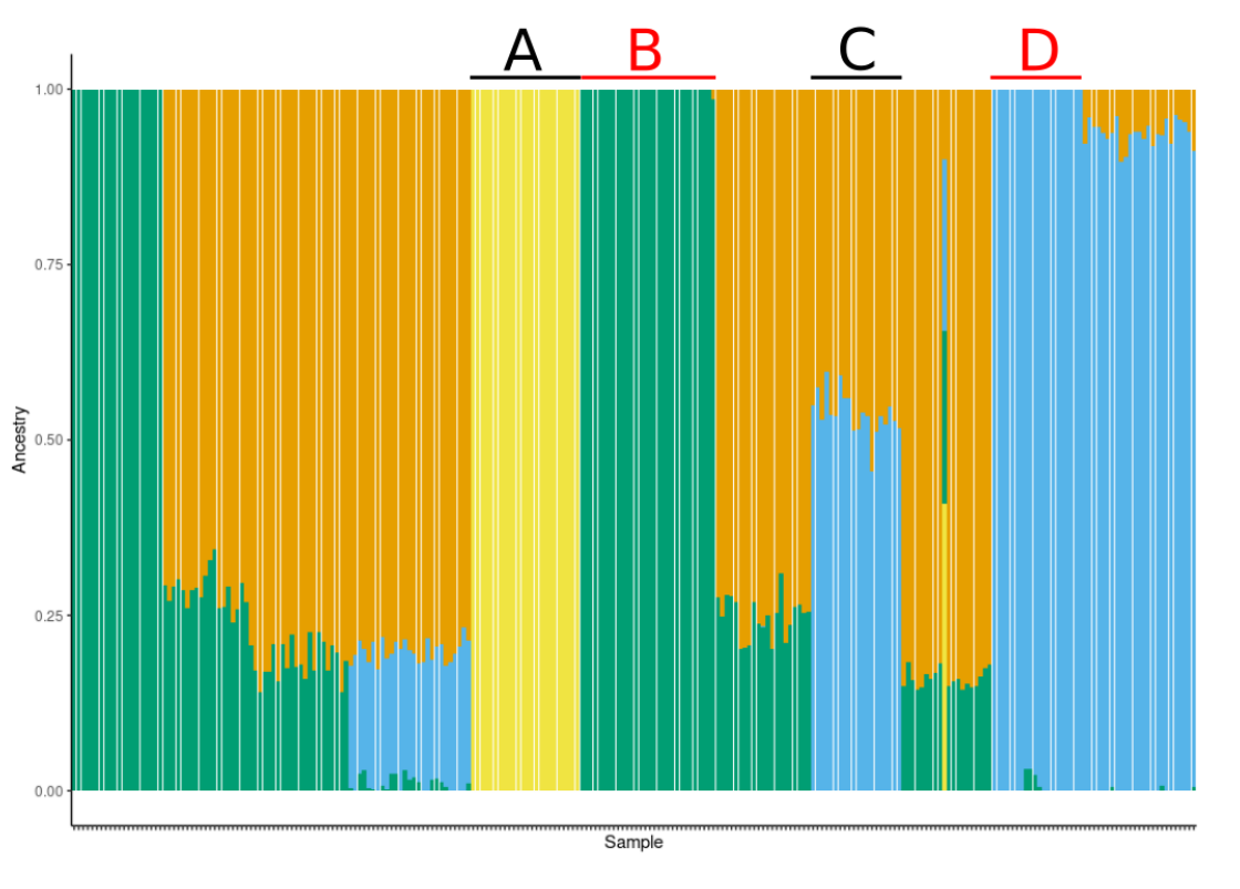
The contribution of alternative populations is in the files with suffix *.Q. We can plot them in R e.g. like this:
setwd(paste0("/scratch/project_2000598/",Sys.getenv("USER"),"/fstat"))

library(ggplot2)

nms <- read.table("LG3.fam")[1:2]
colnames(nms) <- c("pop","smp")

cols <- palette.colors(palette = "Okabe-Ito")[2:6]

pars <- list(
  theme_classic(), xlab("Sample"), ylab("Ancestry"), labs(color=""),
  theme(axis.text.x = element_text(size=2,angle = 90, vjust = 0.5, hjust=1),legend.position = "top",legend.text = element_text(size=6)),
  guides(color= guide_legend(nrow = 1,override.aes = list(size = 3))),
  geom_point(aes(x=smp,y=1.05,col=pop),shape=15,size=1)
)

Q2 <- cbind.data.frame(nms,read.table("LG3.2.Q"))

ggplot(Q2) +
  geom_col(aes(x=smp,y=1),fill=cols[1])+
  geom_col(aes(x=smp,y=V1),fill=cols[2])+
  pars

Q3 <- cbind.data.frame(nms,read.table("LG3.3.Q"))

ggplot(Q3) +
  geom_col(aes(x=smp,y=1),fill=cols[1])+
  geom_col(aes(x=smp,y=V1+V2),fill=cols[2])+
  geom_col(aes(x=smp,y=V1),fill=cols[3])+
  pars
Extend the script and plot also the results for \(K=4\) and \(K=5\).
The algorithm of ADMIXTURE is heuristic and it doesn’t guarantee to find the optimal solution. It would be good to replicate the analyses a few times to see that the solution is stable.
Smartpca and Admixtools
Nick Patterson’s software are a bit cumbersome to run and require the data in a specific format and the parameters listed in “control files”. The first of his programs to use is convertf that converts the data from BIM/BED/FAM to Eigenstrat format. For that, we need to write a parameter file and then execute that:
$ module load eigensoft

$ cat > convert.txt << EOF
genotypename:    LG3.bed
snpname:         LG3.bim
indivname:       LG3.fam
outputformat:    EIGENSTRAT
genotypeoutname: LG3.geno
snpoutname:      LG3.snp
indivoutname:    LG3.ind
EOF

$ convertf -p convert.txt
The program is described in detail here.
Also here, the structure of one of the files has to be modified. In the sample information file, the population name should come last:
$ mv LG3.ind LG3.ind_org
$ sed 's/:/ /' LG3.ind_org | awk '{print $2,$3,$1}' > LG3.ind
Smartpca
Once that is done, we can write a parameter file and run smartpca:
$ cat > smartpca.txt << EOF
genotypename:    LG3.geno
snpname:         LG3.snp
indivname:       LG3.ind
evecoutname:     LG3.pca.evec.txt
evaloutname:     LG3.pca.eval.txt
EOF

$ smartpca -p smartpca.txt  > smartpca.out
The program is described in detail here.
The data are in a slightly different format but we can plot the results similarly to the previous PCA plot:
setwd(paste0("/scratch/project_2000598/",Sys.getenv("USER"),"/fstat"))

library(ggplot2)

vec <- read.table("LG3.pca.evec.txt")
colnames(vec) <- c("smp",paste0("PC",1:10),"pop")

val <- read.table("LG3.pca.eval.txt")[,1]
lab1 <- paste0("PC1 (",round(val[1]/sum(val)*100,2),"%)")
lab2 <- paste0("PC2 (",round(val[2]/sum(val)*100,2),"%)")

ggplot() +
    geom_point(data=vec,aes(PC1,PC2,color=pop)) +
    xlab(lab1) + ylab(lab2) +
    theme_classic()
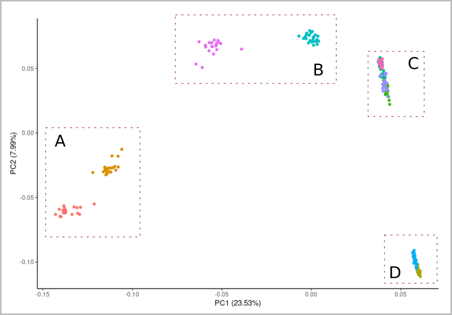
The result shows something but is dominated by the highly differentiated JAP-BIW population. We should replicate the analysis without that:
$ sed 's/JAP-BIW$/Ignore/' LG3.ind > LG3.ind_noOG

$ cat > smartpca_noOG.txt << EOF
genotypename:    LG3.geno
snpname:         LG3.snp
indivname:       LG3.ind_noOG
evecoutname:     LG3.pca_noOG.evec.txt
evaloutname:     LG3.pca_noOG.eval.txt
EOF

$ smartpca -p smartpca_noOG.txt  > smartpca_noOG.out
When plotting the new results, the variation is more clearly visible:
setwd(paste0("/scratch/project_2000598/",Sys.getenv("USER"),"/fstat"))

library(ggplot2)

vec <- read.table("LG3.pca_noOG.evec.txt")
colnames(vec) <- c("smp",paste0("PC",1:10),"pop")

val <- read.table("LG3.pca_noOG.eval.txt")[,1]
lab1 <- paste0("PC1 (",round(val[1]/sum(val)*100,2),"%)")
lab2 <- paste0("PC2 (",round(val[2]/sum(val)*100,2),"%)")

ggplot() +
    geom_point(data=vec,aes(PC1,PC2,color=pop)) +
    xlab(lab1) + ylab(lab2) +
    theme_classic()
The old Admixtools worked in a similar manner through control files. The documentation for that version is here.
Admixtools2
Admixtools2 is a complete rewrite of the software and is implemented as an R library. It has a comprehensive documentation and even provides an interactive browser app. We do some basic analyses using the R command interface.
F3
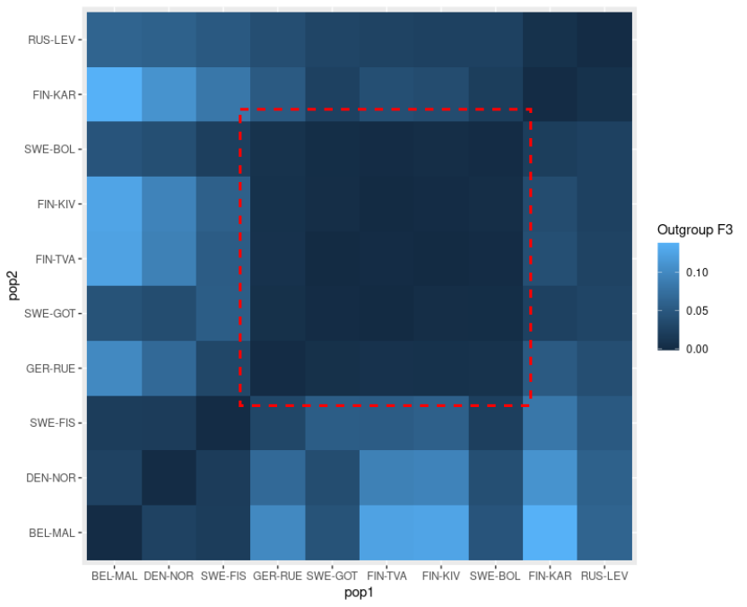
We start with the Outgroup F3 statistics. These (and much else) are computed from pairwise F2 statistics:
setwd(paste0("/scratch/project_2000598/",Sys.getenv("USER"),"/fstat"))

# admixtools has now been installed on Puhti and the line below should not be needed
#.libPaths(c("/projappl/project_2000598/project_rpackages_4.4.0", .libPaths()))
library(admixtools)
library(tidyverse)

# compute F2 and then F3
extract_f2("LG3", "f2_stats")
f3_stats <- f3("f2_stats")
f3_og <- f3_stats %>% filter(pop3=="JAP-BIW") %>% select(pop1,pop2,est)

# the statistics are computed only for one triangle of the matrix and
# these are duplicated to make a full matrix (there are ways for this)
mat <- f3_og %>% mutate_if(is.character, factor) %>%
    xtabs(est ~ pop1 + pop2, ., drop.unused.levels = F) %>% '+'(., t(.))

# this matrix is plotted but the result looks messy
ggplot(as.data.frame(mat)) + geom_tile(aes(x=pop1,y=pop2,fill=Freq)) + labs(fill="Outgroup F3")

# populations are ordered manually from south-west to north-east and
# data are rearranged in that order
pops <- c("BEL-MAL","DEN-NOR","SWE-FIS","GER-RUE","SWE-GOT","FIN-TVA","FIN-KIV","SWE-BOL","FIN-KAR","RUS-LEV")
mat <- f3_og %>% mutate_if(is.character, factor, levels=pops) %>%
    xtabs(est ~ pop1 + pop2, ., drop.unused.levels = F) %>% '+'(., t(.))

# the plot looks slightly better
ggplot(as.data.frame(mat)) + geom_tile(aes(x=pop1,y=pop2,fill=Freq)) + labs(fill="Outgroup F3")F4
The beauty of the new implementation of algorithms is that they can utilise precomputed F2 statistics. In the case of missing data, this may not be identical to computing everything from scratch, but it should in most cases do fine. Those applying the method to own data can find the details of this in the comprehensive documentation.
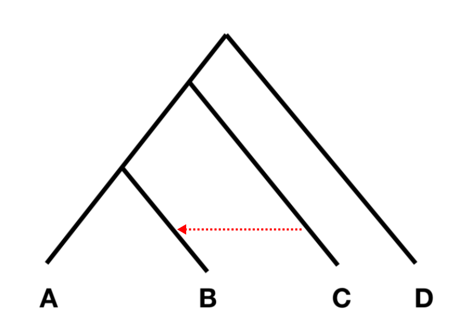
The order of populations is from left to right and the statistics tests whether there is evidence of gene flow from C to B (as below), or from C to A.
The test statistic should be 0 if there is no gene flow. The method uses block-jackknifing, that is the data are divided into genomic blocks that are computed independently, to estimate the confidence intervals. The F4 statistics can be computed for one set of populations or a list of populations:
f2_blocks = f2_from_precomp("f2_stats")

# western introgression
f4(f2_blocks, "RUS-LEV", "GER-RUE", "DEN-NOR","JAP-BIW")
f4.res <- f4(f2_blocks, "RUS-LEV", pops[3:9], "DEN-NOR","JAP-BIW")

ggplot(f4.res) +
  geom_hline(yintercept = 0,col="gray")+
  geom_errorbar(aes(x=pop2,ymin=est-se, ymax=est+se))+
  geom_point(aes(x=pop2,y=est)) + theme_classic()

# eastern introgression
f4(f2_blocks, "DEN-NOR", pops[3:9], "RUS-LEV","JAP-BIW")
The last output columns are the test statistic estimate, standard error, Z score and p value. Note that the p value may not be significant even if the estimate is different from 0.
F4 ratio test
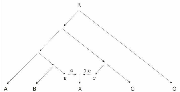
The phylogeny for F4 ratio test is the following:
and, in the old Admixtools, the test populations were specified as “A O : X C :: A O : B C”. In Admixtools2, one needs to define five populations and those can be obtained from the old format in the order of appearance: “A, O, X, C, B”. The estimated parameter is \(\alpha\) and \(1-\alpha\) can be resolved from that.
With our data, we can test \(\alpha\) for gene flow from the Western linage (WL) to the Baltic Sea populations by placing two WL populations (BEl-MAL and DEN-NOR) at positions A and B, and the Baltic populations on position of X. Population C should one of the supposedly “clean” Eastern lineage (EL) populations, either FIN-KAR or RUS-LEV.
The Eastern gene flow is tested similarly by placing the EL populations at positions A and B, and one of the WL population at position C. We use JAP-BIW as the outgroup O.
# alpha for WL. Population order: A, O, X, C, B
f4r.wl <- qpf4ratio(f2_blocks,as.matrix(tibble("BEL-MAL","JAP-BIW",pops[3:8],"FIN-KAR","DEN-NOR")))
f4r.wl

# alpha for EL. Population order: A, O, X, C, B
f4r.el <- qpf4ratio(f2_blocks,as.matrix(tibble("RUS-LEV","JAP-BIW",pops[3:8],"DEN-NOR","FIN-KAR")))

# combine into one data frame
f4r.res <-cbind.data.frame(
    f4r.wl[,c(3,6:8)] %>% rename_with(.fn = ~paste0("WL.",.),.cols = !"pop3"),
    f4r.el[,c(6:8)] %>% rename_with(.fn = ~paste0("EL.",.))
  )

# and plot
ggplot(f4r.res) +
  geom_errorbar(aes(x=pop3,ymin=WL.alpha-WL.se, ymax=WL.alpha+WL.se)) +
  geom_point(aes(x=pop3,y=WL.alpha),col="red",size=3) +
  geom_errorbar(aes(x=pop3,ymin=EL.alpha-EL.se, ymax=EL.alpha+EL.se)) +
  geom_point(aes(x=pop3,y=EL.alpha),col="blue",size=3) +
  coord_flip() + ylab("alpha") + ylim(0,1)+
  theme_classic()
The alpha values estimated for WL and EL gene flow do not necessarily need to sum to 1. We hypothesised in our article that the Baltic icelakes may have contained sticklebacks during the last glacial maximum and the current populations are not formed by a simple admixture of EL and WL since the retreat of the ice.
Admixture graphs
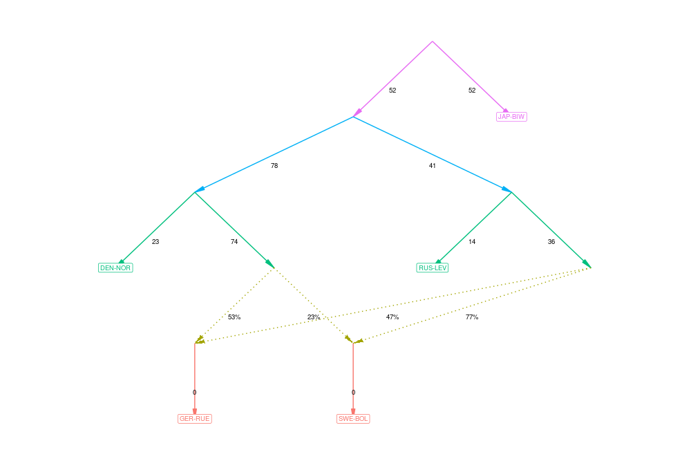
The idea of admixture graphs is to find a graph representation of population relationships such that the observed distances between populations and distances computed from the graph match as closely as possible. The observed distances are the F2 statistics that we have already computed. However, the number of possible graphs to represent the population relationships is huge and finding the optimal solution (or even pretty close to that) can be really difficult.
In the old Admixtools (known as qpGraph), the models of population relationships were constructed manually. The R package admixtools provides an easy-to-use function to explore the possible solutions and look for good ones.
# select just five populations to keep the graph simple
f2_blocks = f2_from_precomp("f2_stats",pops=c("DEN-NOR","GER-RUE","SWE-BOL","RUS-LEV","JAP-BIW"))

# perform automated search with default options and no admixture
graph_0 <- find_graphs(f2_blocks, numadmix = 0, outpop = 'JAP-BIW')

# once ready, see the top scores
graph_0 %>% select(score) %>% arrange(score) %>% head()

# select the very best for plotting
best <- graph_0 %>% slice_min(score, with_ties = FALSE)
best$score[[1]]
plot_graph(best$edges[[1]])

# repeat with 1, 2 and 3 admixture events
graph_1 <- find_graphs(f2_blocks, numadmix = 1, outpop = 'JAP-BIW')
graph_2 <- find_graphs(f2_blocks, numadmix = 2, outpop = 'JAP-BIW')
graph_3 <- find_graphs(f2_blocks, numadmix = 3, outpop = 'JAP-BIW')

# plot similarly to the first one
The goodness of the solution is reported with a Z score. Like in any statistical model, the likelihood of the data improves as one adds more parameters in the model. Good solutions should have small Z scores, but models with Z scores very close to zero are likely overfitted, i.e. have too many admixture events. Secondly, one should note that, with several populations, the search may not immediately find good solutions and the analysis should be more extensive (and time-consuming) than presented here. See the comprehensive documentation.
The authors of the method wrote a comprehensive article about the analysis of admixture graphs and showed that many previously published admixture results have contained dubious statements. They stress that all graphs that are not statistically worse than the best graph should be considered as potentially true solutions. As many graphs are “correct”, one should only trust features that are consistently found in all of them.
\(F_{ST}\): average and across sites
The FST distances can be computed with admixtools:
setwd(paste0("/scratch/project_2000598/",Sys.getenv("USER"),"/fstat"))

# admixtools has now been installed on Puhti and the line below should not be needed
#.libPaths(c("/projappl/project_2000598/project_rpackages_4.4.0", .libPaths()))
library(admixtools)
library(tidyverse)

f2_blocks = f2_from_precomp("f2_stats")
fst <- fst(f2_blocks)

# pick one estimate
fst %>% filter(pop1=="DEN-NOR" & pop2=="RUS-LEV")

# the order of populations isn't ideal
ggplot(fst) + geom_tile(aes(x=pop1,y=pop2,fill=est)) + labs(fill="FST")

# order them manually
pops <- c("BEL-MAL","DEN-NOR","SWE-FIS","GER-RUE","SWE-GOT","FIN-TVA","FIN-KIV","SWE-BOL","FIN-KAR","RUS-LEV","JAP-BIW")

# new order needs a square matrix
mat <- fst %>% mutate_if(is.character, factor, levels=pops) %>%
  xtabs(est ~ pop1 + pop2, ., drop.unused.levels = F) %>% '+'(., t(.))

# plot looks better
ggplot(as.data.frame(mat)) + geom_tile(aes(x=pop1,y=pop2,fill=Freq)) + labs(fill="FST")
Often, computation directly from a VCF file can be useful and a much used program for that is vcftools. However, that program should be used with care as it’s badly outdated and the implementation of the FST computation is questionable.
One could do a basic analysis like this:
$ cd $WORK/$USER/fstat
$ module load vcftools
$ module load samtools

$ bcftools query -l LG3_snps.vcf.gz | grep DEN-NOR > den_nor.txt
$ bcftools query -l LG3_snps.vcf.gz | grep RUS-LEV > rus_lev.txt

$ vcftools --gzvcf LG3_snps.vcf.gz --weir-fst-pop den_nor.txt --weir-fst-pop rus_lev.txt --out WL-EL
The main output is the estimates for each variant site but the end of the log file may be more interesting:
$ head WL-EL.weir.fst
$ tail WL-EL.log
In the log file, the line “Weir and Cockerham weighted Fst estimate” is technically more correct and corresponds to “the ratio of averages” as recommended by Bhatia et al. in their paper. However, the value is still very different from the one obtained with admixtools, possibly party because of the different way of handling the missing data. The output in the *.weir.fst file is hardly useful as such and averaging over many sites is exactly “the average of ratios” criticised by Bhatia et al. and likely leads to erroneous results.
The analysis can be done in genomic windows:
$ vcftools --gzvcf LG3_snps.vcf.gz --weir-fst-pop den_nor.txt --weir-fst-pop rus_lev.txt --out WL-EL_step --fst-window-size 50000 --fst-window-step 50000These estimates can be plotted various ways using R, but the use of “Gviz” allows easy integration of e.g. gene annotations:
setwd(paste0("/scratch/project_2000598/",Sys.getenv("USER"),"/fstat"))

library(Gviz)
library(GenomicFeatures)

options(ucscChromosomeNames=FALSE)

axisTrack <- GenomeAxisTrack( )

fst.vcf <- read.table("WL-EL_step.windowed.weir.fst",header=T)
fstTrack <- DataTrack(chrom="LG3", start = fst.vcf$BIN_START, end=fst.vcf$BIN_END,
    data = fst.vcf$WEIGHTED_FST, name = "FST", genome="ninespine")

plotTracks(list(axisTrack,fstTrack),type="l")
I’m not sure how much one can trust on FST estimates computed with vcftools. I’ve used it in the past but am getting increasingly suspicious of the implementation of many functions. The development of the program has ceased years ago.
Population genetics studies changes in allele frequencies and the differences between populations allow inferences of their history and relationships. \(F_{ST}\) has been around for a long time. In its original definition, it should be used to study only the drift since the populations’ split from a common ancestor. However, it is widely used to identify genomic regions where the allele frequency differences stand out from the normal range. These regions may have been targets of (adaptive) selection.
The \(F\) statistics have recently been further developed to utilise the full power of large genome data. Many statistics are based on combinations of pairwise \(F2\) statistics. Outgroup \(F3\) measures the relative amount shared drift to a common outgroup and works as a measure of distance between the ingroup populations. \(F4\) measures whether the drift between two pairs of populations has been independent; if it is not, there must have been gene flow between the two pairs. The \(F4\) ratio test builds on that and estimates the amount of ancestry from one of the candidate parental lineages. Admixture graphs model the relationships between populations and consider both the bifurcating history and potential admixture events between the lineages.
