7. F-statistics and admixture
After this chapter, the students can calculate the classical \(F_{ST}\) as a measure of population differentiation. They can describe the use of \(F3\) and \(F4\) statistics in population genetics studies and explain the basic theory behind admixture graphs (qpGraphs). They can interpret ADMIXTURE plots and identify potential misuses of the concept in published literature.
Population subdivision
Allele frequencies in population change over time due to drift and other processes. If the population is structured, i.e. divided into sub-populations with limited migration, frequencies are expected to differ between sub-populations. The classical measure for population subdivision is Wright’s \(F_{ST}\): it assumes that the studied populations derive from an ancestral population and the allele frequency differences between the populations reflect the amount of drift. If the population are of a similar size and the size is approximately constant, \(F_{ST}\) reflects the time since the population divergence.
\(F_{ST}\) is a part of \(F\) statistics that measure the amount of heterozygosity on different levels of a population system.
\(H_O\): observed heterozygosity within a subpopulation
\(H_I\): mean observed heterozygosity within subpopulations
\(H_E\): expected heterozygosity within a subpopulation
\(H_S\): mean expected heterozygosity within subpopulations
\(H_T\): expected heterozygosity in the whole population
If allele frequencies differ between sub-populations, \(H_T > H_S\).
\[ F_{ST} = \frac{H_T-H_S}{H_T}\]
\(F_{ST}\) in practice
This example is based on this web page.
Let’s assume that we have sampled three populations and observe the following genotypes:
| AA | Aa | aa | total | |
|---|---|---|---|---|
| Population 1 | 125 | 250 | 125 | 500 |
| Population 2 | 50 | 30 | 20 | 100 |
| Population 3 | 100 | 500 | 400 | 1000 |
The last column tells the total number of individuals; the number of alleles is TWICE the number of genotypes.
From the observations, we can compute the allele frequencies: each homozygote will have two alleles, each heterozygote will have one allele. \(p1\) and \(q1\) stand for the frequencies of alleles A and a in Population 1.
\[\begin{align*} p_1 &= (2*125 + 250)/1,000 = 0.50\\ q_1 &= 0.5\\ p_2 &= (2*50 + 30)/200 = 0.65\\ q_2 &= 0.35\\ p_3 &= (2*100 + 500)/2,000 = 0.35\\ q_3 &= 0.65 \end{align*}\]
From the table of observations, we can compute the Observed heterozygosity, and from the allele frequencies the Expected heterozygosity (2pq):
\[\begin{align*} H_{obs1} &= 250/500 = 0.5\\ H_{obs2} &= 30/100 = 0.3 \\ H_{obs3} &= 500/1000 = 0.5 \\ \end{align*}\]
\[\begin{align*} H_{exp1} &= 2*0.5*0.5 = 0.5~~~~~~~~~\textrm{[Observed = Expected]}\\ H_{exp2} &= 2*0.65*0.35 = 0.46~~~\textrm{[Observed < Expected]}\\ H_{exp3} &=2*0.35*0.65 = 0.46~~~\textrm{[Observed > Expected]}\\ \end{align*}\]
From these, we can compute the first measure, the population inbreeding coefficient: \(F = (H_{exp} - H_{obs}) /H_{exp}\).
\[\begin{align*} F_1 &= (0.5 - 0.5)/0.5 = 0\\ F_2 &= (0.46 - 0.3)/0.46 = 0.341~~~~~~\textrm{[heterozygote deficit indicates inbreeding]}\\ F_3 &= (0.46 - 0.5)/0.46 = -0.099~~~\textrm{[excess heterozygotes indicate outbreeding]}\\ \end{align*}\]
The frequency of alleles A and over all populations:
\(\bar p = (0.5*1,000 + 0.65*200 + 0.35*2,000) / 3,200 = 0.4156\)
\(\bar q = (0.5*1,000 + 0.35*200 + 0.65*2,000) / 3,200 = 0.5844\)
From these, we can compute the heterozygosity indices over individuals, subpopulations and the total population.
\(H_I\) is based on the observed heterozygosities in populations:
\[\begin{align*}H_I &= (H_{obs1}*N_1 + H_{obs2}*N_2 + H_{obs3}*N_3)/N_{TOTAL} \\ &=(0.5*500 + 0.3*100 + 0.5*1000) / 1,600 = 0.4875\\ \end{align*}\]
\(H_S\) is based on the expected heterozygosities in subpopulations:
\[\begin{align*}H_S &= (H_{exp1}*N_1 + H_{exp2}*N_2 + H_{exp3}*N_3)/N_{TOTAL}\\ &= (0.5*500 + 0.46*100 + 0.46*1000) / 1,600 = 0.4691\\ \end{align*}\]
\(H_T\) is based on the expected heterozygosities overall: \[\begin{align*}H_T &= 2*\bar p * \bar q \\ &= 2 * 0.4156 * 0.5844 = 0.0.4858\\ \end{align*}\]
And finally, the F-statistics:
\[\begin{align*} F_{IS} &= (H_S - H_I)/H_S \\ &= (0.4691 - 0.4875) / 0.4691 = -0.0393\\ \\ F_{ST} &= (H_T - H_S)/H_T \\ &= (0.4858 - 0.4691) / 0.4858 = 0.0344\\ \\ F_{IT} &= (H_T - H_I)/H_T] \\ &= (0.4858 - 0.4875)/0.4858 = -0.0036\\ \end{align*}\]
All of which tells us that: Population 1 is consistent with HWE, Population 2 is inbred, and Population 3 may have disassortative mating or be experiencing a Wahlund effect (more heterozygotes than expected).
Subdivision of populations, possibly due to genetic drift, accounts for approx. 3.4% of the total genetic variation, and the set of populations, as a whole, shows no signs of inbreeding (\(F_{IT}\) is nearly zero).
It is notable that the \(F_{ST}\) estimation method used above is affected by the sample size. This is easy to see when the same allele frequency is obtained from very different sample sizes. On the left, we have slightly changed genotype counts and, on the right, the pairwise \(F_{ST}\) estimates:
| AA | Aa | aa | total | \(H_{exp}\) | |
|---|---|---|---|---|---|
| Population 1 | 125 | 250 | 125 | 500 | 0.5 |
| Population 2 | 20 | 40 | 20 | 100 | 0.5 |
| Population 3 | 100 | 500 | 400 | 1000 | 0.455 |
| \(F_{ST}\) | |
|---|---|
| Pop1-Pop2 | 0.0 |
| Pop1-Pop3 | 0.0208 |
| Pop2-Pop3 | 0.0067 |
Population 1 and 2 have equal allele frequencies but very different sample sizes. As their allele frequencies are identical, the pairwise \(F_{ST}=0\). However, despite the equal allele frequencies, their pairwise \(F_{ST}\) to Population 3 are different!
There are other estimators for \(F_{ST}\) and not all of them are similarly affected. See the next paragraph for a link to a paper discussing that in detail.
Final notes on \(F_{ST}\)
There are many definitions of \(F_{ST}\) and many estimators for estimating it. With genomic data, an additional complexity is to combine the estimates from a large number of loci into one value. Even that can be surprisingly difficult. Bhatia et al. wrote an excellent paper on the topic and provide best practices for computing \(F_{ST}\) from genomic data.
The classical definition of \(F_{ST}\) is that the allele differences have been created by drift only. The measure is widely “misused” for purposes and a local change in allele frequencies can be created e.g. by adaptive evolution and selection favouring different allelic forms in different environments. We used \(F_{ST}\) to identify gene regions under selection in a population of ringed seals in Greenland. These ringed seals are morphologically distinct and appear to have adaptions to the very different conditions in a fjord full of icebergs.
F Statistics
This part utilises the material produced by Stephan Schiffels for his 2018 workshop in Helsinki.
F3 Statistics
F3 statistics are a useful analytical tool to understand population relationships. F3 statistics, just as F4 and F2 statistics measure allele frequency correlations between populations and were introduced by Nick Patterson in his paper Patterson 2012.
F3 statistics are used for two purposes:
- as a test whether a target population (C) is admixed between two source populations (A and B), and
- to measure shared drift between two test populations (A and B) from an outgroup (C).
F3 statistics are in both cases defined as the product of allele frequency differences between population C to A and B, respectively:
\[ F3(A, B; C)=\langle(c-a)(c-b)\rangle \]
Here, \(\langle\cdot\rangle\) denotes the average over all genotyped sites, and \(a, b\) and \(c\) denote the allele frequency for a given site in the three populations \(A, B\) and \(C\).
In practice, \(a, b\) and \(c\) would be the columns of an allele frequency table like this:
| SNP | Freq_A | Freq_B | Freq_C |
|---|---|---|---|
| pos_1 | 0 | 0.2 | 0 |
| pos_2 | 0 | 0.278 | 0 |
| pos_3 | 0 | 0.389 | 0.722 |
| pos_4 | 0 | 0 | 0 |
| pos_5 | 0.95 | 0.4 | 0.95 |
| pos_6 | 0 | 0.4 | 0 |
| pos_7 | 1 | 0.4 | 0.9 |
| pos_8 | 0 | 0.3 | 0 |
| pos_9 | 0.9 | 0.3 | 0.75 |
| pos_10 | 1 | 0.4 | 0.9 |
| pos_11 | 1 | 0.7 | 0.9 |
| pos_12 | 1 | 0.7 | 0.9 |
| pos_13 | 1 | 0.7 | 0.9 |
| pos_14 | 1 | 0.65 | 0.9 |
| pos_15 | 0.95 | 0.4 | 0.95 |
Admixture F3 Statistics
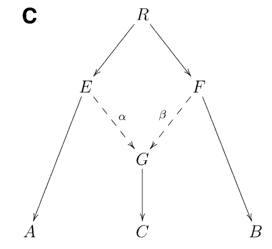
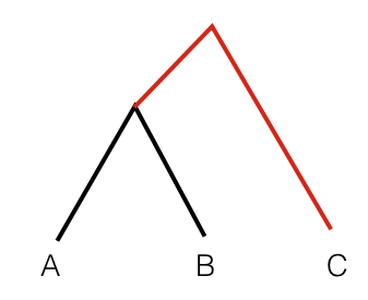
It can be shown that if that statistics is negative, it provides unambiguous proof that population C is admixed between populations A and B, as in the following phylogeny (taken from Figure 1 from Patterson 2012):
Intuitively, an F3 statistics becomes negative if the allele frequency of the target population (C) is on average intermediate between the allele frequencies of A and B. Consider as an extreme example a genomic site where \(a=0, b=1\) and \(c=0.5\). Then we have \((c-a)(c-b)=-0.25\), which is negative. So if the entire statistics is negative, it suggests that in many positions, the allele frequency \(c\) is indeed intermediate, suggesting admixture between the two sources.
If an F3 statistics is not negative, it does not proof that there is no admixture!
F4 Statistics
A different way to test for admixture is by “F4 statistics” (or “D statistics” which is very similar), also introduced in Patterson 2012.
F4 statistics are also defined in terms of correlations of allele frequency differences, similarly to F3 statistics (see above), but involving four different populations, not just three. Specifically we define
\[ F4(A, B; C, D)=\langle(a-b)(c-d)\rangle. \]
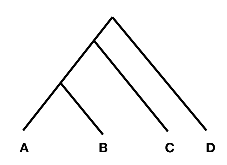
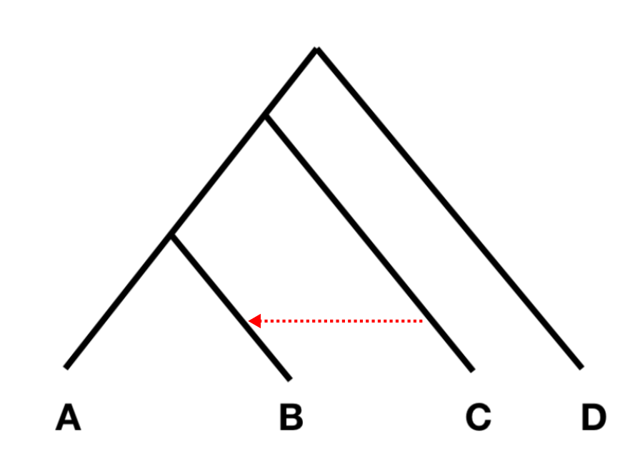
To understand the statistics, consider the tree on the left:
In this tree, without any additional admixture, the allele frequency difference between A and B should be completely independent from the allele frequency difference between C and D. (Note that the differences between A and B are caused by genetic drift in the branches connecting A and B, while the differences between C and D are caused genetic drift in the branches connecting C and D; as these branches do not overlap, the genetic drift in them should be independent.)
If the allele frequency difference between A and B, and between C and D are independent, F4(A, B; C, D) should be zero, or at least not statistically different from zero. However, if there was gene flow from C or D into A or B, the statistic should be different from zero. Specifically, if the statistic is significantly negative, it implies gene flow between either C and B (shown with a red arrow in the figure on the right), or D and A. If it is significantly positive, it implies gene flow between A and C, or B and D.
The way this statistic is often used, is to put a divergent outgroup as population D, for which we know for sure that there was no admixture into either A or B. With this setup, we can then test for gene flow between C and A (if the statistic is positive), or C and B (if it is negative).
F4 ratio test
The F4 statistic tests if the allele frequency changes between two pairs of populations shows correlation. In the figure above, the changes in the paths A-B and C-D should be independent and the statistic shouldn’t differ from zero.
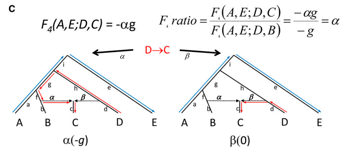
The F4 statistic can be computed for any two pairs of populations and Patterson 2012 introduced a test based on a particular set-up. The tree below depicts a test based on F4, the “F4 ratio test”, that allows estimating the proportion of different ancestries in population C that is generated by admixture of lineages leading to populations C and D. The “admixture” can be either sudden contact and mixing of two populations or more lasting gene flow one population to another.
In the left tree, the blue and red arrows indicate the paths between A and E, and between C and D; it is notable that the path from D to C goes via the lineage leading to B. The genetic drifts (and allele frequency differences between the populations) have happened on these paths. The right tree shows the same but now the path from D to C is direct. The parameters of interest are \(\alpha\) and \(\beta\) (where \(\beta=1-\alpha\)) that indicate how much of the ancestry of population C comes from the B lineage and from the D lineage, respectively.
The statistic F4(A, E; D, B) compares A-E to D-B, and if you draw those paths in the tree, you will notice that they share one branch in the tree, marked as \(g\). If you do the same for F4(A, E; D, C) in the right tree, you should find that they do not share any branch and should thus not show any correlation in allele frequency changes. However, if you do that on the left tree, they again share the branch \(g\). The assumption now is that a proportion of sites, indicated as \(\alpha\), are introgressed from the B side and using the two F4 statistics, we can estimate this proportion.
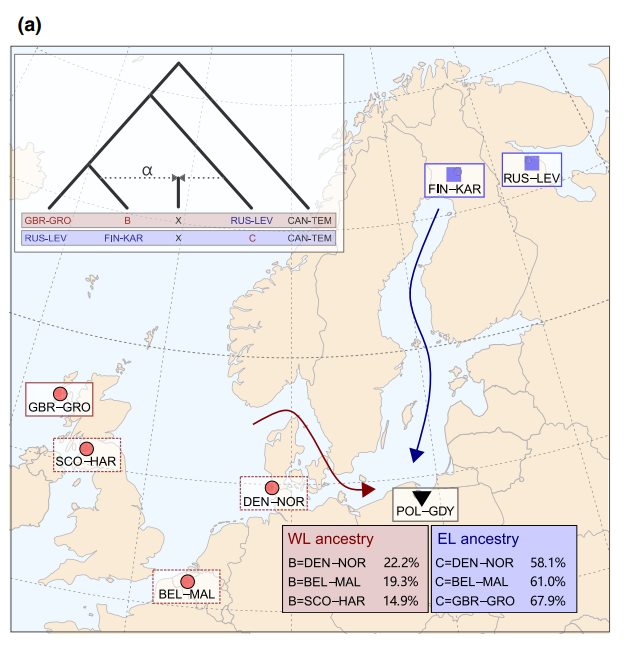
We used the same approach to study the admixture in nine-spined sticklebacks:
A notable observation was that the estimated admixture ratios varied significantly depending on the source population used.
Outgroup F3 Statistics
Outgroup F3 statistics are a special case how to use F3 statistics. The definition is the same as for Admixture F3 statistics, but instead of a target C and two source populations A and B, one now gives an outgroup C and two test populations A and B.
To get an intuition for this statistics, consider the following tree:
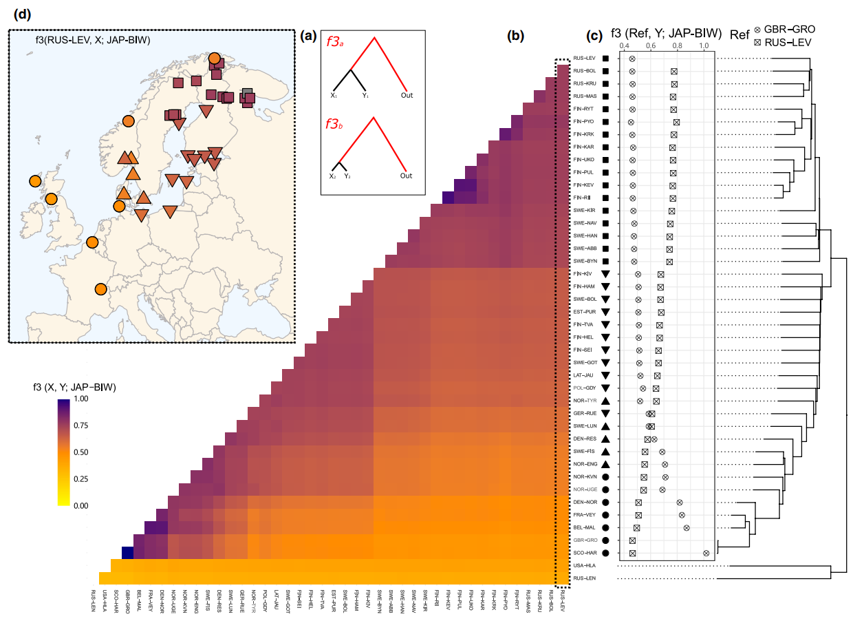
In this scenario, the statistic F3(A, B; C) measures the branch length from C to the common ancestor of A and B, coloured red. So this statistic is simply a measure of how closely two population A and B are related with each other, as measured from a distant outgroup. It is thus a similarity measure: The higher the statistic, the more genetically similar A and B are to one another.
We used the same approach to study the relationships of nine-spined sticklebacks:
Admixture graphs
Single F3 and and F4-statistics can tell us how three or four populations are related to each other. This concept can be generalized to any number of populations using admixture graphs. The idea of an admixture graph is to find a topology and edge weights that minimize the difference between fitted and estimated F3-statistics. The difference is summarised in a likelihood score, and a good model should fit all F3-statistics and have a score close to zero.
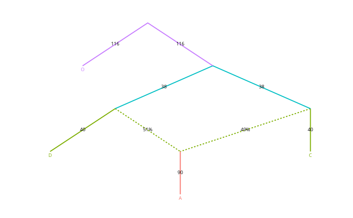
The idea was first introduced and implemented in Nick Patterson’s program qpGraph, a part of Admixtools package. It is now much simplified in the R package Admixtools2. A simple graph could look like this:
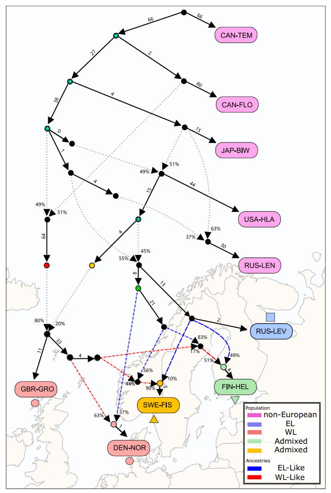
Here, the solid lines represent drift, the numbers being multiplied by 1,000 for clarity, and the dotted lines represent admixture of two sources, the numbers indicating the percentages.
We used the same approach to study the history of nine-spined sticklebacks:
The complex history and highly different backgrounds of the Western lineage populations (shown in red) explain why the F4 ratio test results were so sensitive to the source population used in the analysis. The full study is available at the Molecular Ecology website.
STRUCTURE and ADMIXTURE
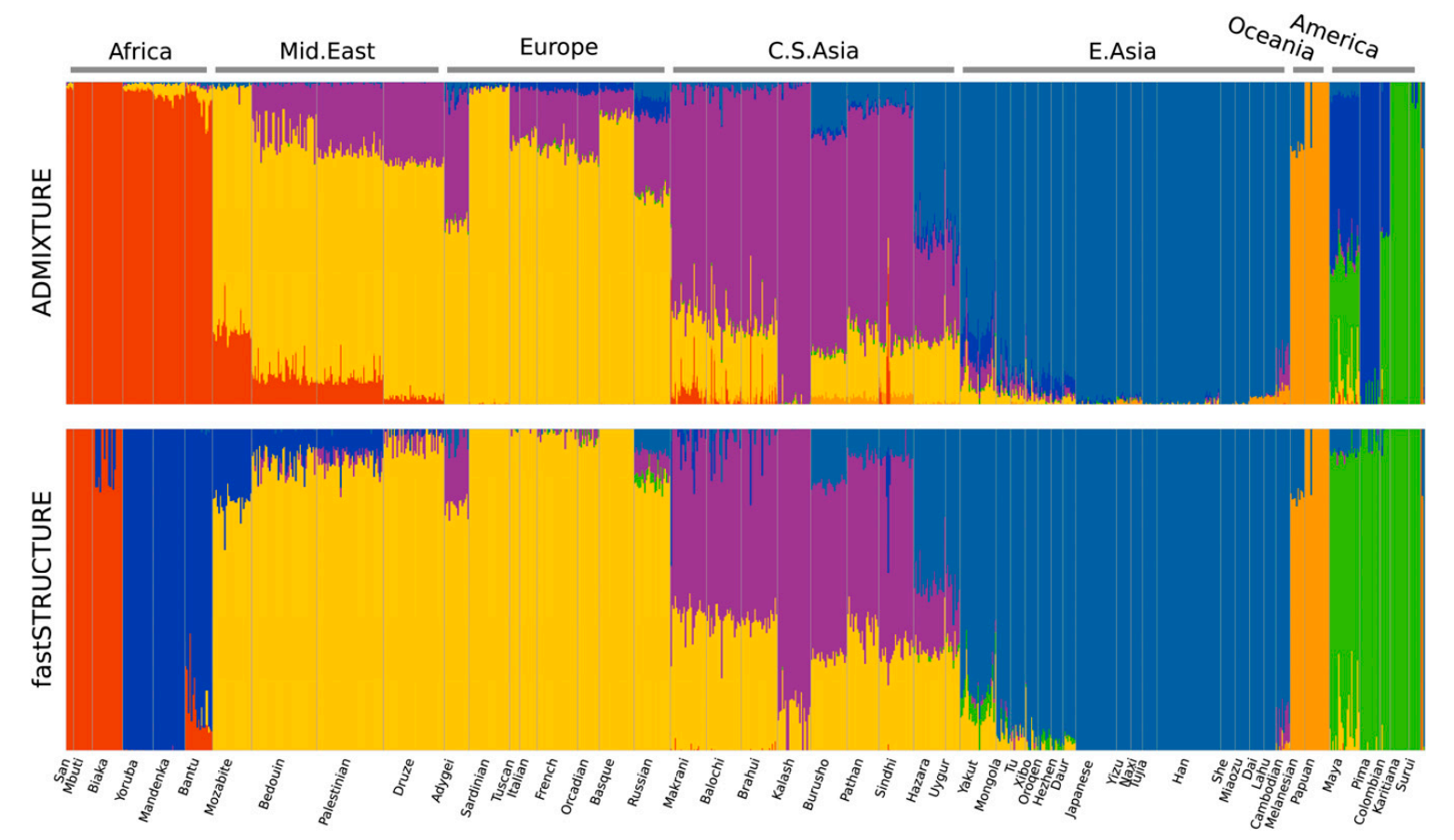
A completely different approach studying “admixture” is provided by softwares such as STRUCTURE, fastSTRUCTURE and Admixture. They assume a population ancestral to all the samples, split that into \(K\) hypothetical populations and reconstruct the observed samples as mixtures of these \(K\) hypothetical populations. The parameter of interest is contribution of each hypothetical ancestral population to our sample genomes.
The output of these analyses is typically a plot where each sample is presented as a vertical bar such that the different colours represent the relative contribution of one hypothetical ancestral population. The figure below shows plots generated with two different methods by Raj et al. (2013) for human data:
The plots look nice and are relatively easy to read. They do contain valid information but should be considered exploratory analyses and not interpreted in too much detail without additional information.
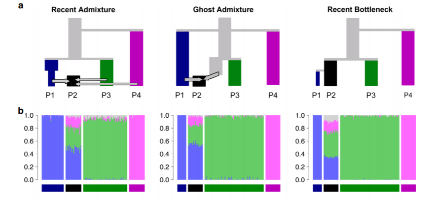
The greatest difficulty with these plots is that vastly different evolutionary scenarios can produce seemingly identical admixture plots, and there’s a great risk that researchers cherry-pick and interpret the results to support their favourite hypothesis. The figure below, from an article by Lawson et al. (2018), shows that three very different evolutionary processes (top) produce similar admixture plots (bottom):
Lawson et al. (2018) provide some guidelines and instructions for critical analysis and reporting of findings.
STRUCTURE and ADMIXTURE plots are easy-to-interpret representations of the relationships among individuals and the structure in genomic variation. However, the information contained in the plots can easily be misinterpreted and many different evolutionary histories can produce seemingly similar results.
The \(F2\) statistic measures genetic drift between population pairs. \(F2\) can be extended to \(F3\) and \(F4\) to estimate presence of gene flow or the distance between populations. The \(F4\) ratio test builds on two \(F4\) statistics and measures the gene flow from one parental lineage to an admixed population. The \(F2\) statistics can be fitted to a graph representing the population relationships as well as admixture events between lineages.

